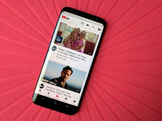
YouTube brings design changes full circle with new logo and more mobile features

One of the world's most popular video sites is growing, diversifying in content and platform, and its design is evolving, too. We've told you over the previous months how a new desktop design (with a dark mode, no less) was introduced earlier this year for users to test, and the YouTube app has already been redesigned once this year.
And it's not done yet.
Outlined in a blog post, YouTube's mobile apps are losing the red banners, letting the content be the only color on screen. YouTube is also going beyond the double-tap to fast-forward, and will soon experiment with swiping left and right to switch between videos. That will be a very interesting experiment, indeed, given how many of us are used to swiping back in forth in Google Play Movies and often forget the different interface when we switch back to YouTube.
YouTube's look and feel is evolving as fast as the content it's hosting.
Speed controls are also coming to the mobile app, so you can slow down and speed up videos as needed, and YouTube's mobile app will adapt to different aspect ratios of videos, including the dreaded vertical video. No more black bars!
The new desktop design YouTube's been testing for months is rolling out to everyone, at last, including our beloved dark theme, which now needs to make the jump to mobile. YouTube is also updating its logo, putting the app icon on the left while making the YouTube text a little bolder and all the same color.
There's a lot here to unpack, and a lot that'll be rolling out in the days and weeks ahead, so what are you most excited about? What are you hoping to see coming soon?
Be an expert in 5 minutes
Get the latest news from Android Central, your trusted companion in the world of Android
Ara Wagoner was a staff writer at Android Central. She themes phones and pokes YouTube Music with a stick. When she's not writing about cases, Chromebooks, or customization, she's wandering around Walt Disney World. If you see her without headphones, RUN. You can follow her on Twitter at @arawagco.

