Android Pie and One UI on Samsung Galaxy S9: Top 7 things to know
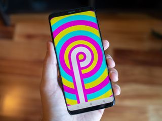
After watching the Android 9 Pie launch from the sidelines as other phones received it in late 2018, it's finally our turn. The Galaxy S9 and S9+ (alongside the Galaxy S8, S8+ and Note 9) have an Pie update of their own that's rolling out now, and better yet it comes with a new One UI interface that completely changes the way the phone looks and operates.
This is a pretty big change to take in, but mostly a good one. Here's what you can expect when it arrives on your phone.
Visual simplicity is the name of the game
Samsung's primary goal with One UI is to simplify and further de-clutter the interface. The last version of Samsung Experience was already far cleaner than any prior, but Samsung's gone a clear step further this time. Interface elements are notably larger, more spread out, and easier to understand. If you're used to previous Samsung software you may feel like the information density on some of the screens isn't high enough, but you can't argue the merits of cleaning things up a bit.
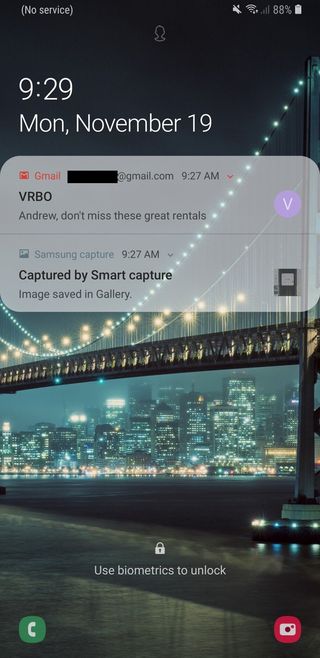
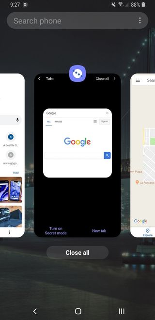
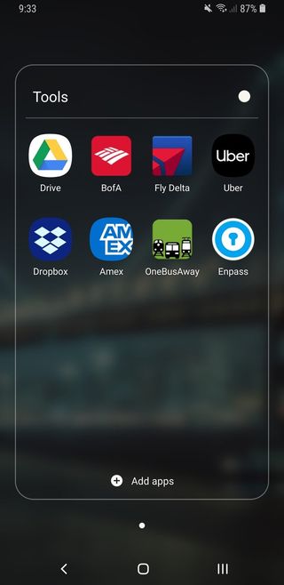
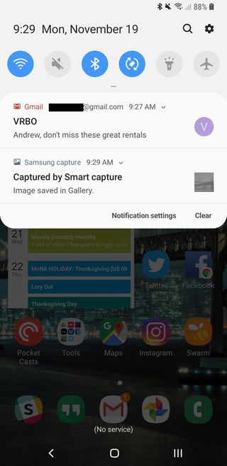
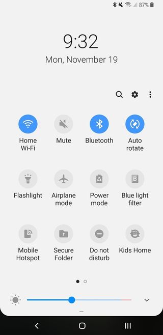
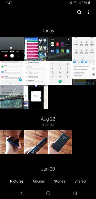
With the default theme, One UI derives even more of its styling from Android 9 Pie you'll find on the Google Pixel 3. There's an even wider use of whites and greys, lots of subtle translucency, rounded corners, and even softer colors. At a glance, many parts of One UI are extremely close to "stock" Android 9 Pie.
The icons are ... different
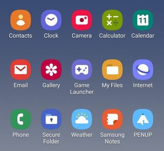
Along with this new visual clarity across the interface, Samsung applied perhaps the most radical changes to the iconography. All of the icons have swung well into the "minimalist" mindset, dramatically flattening out and simplifying every system app's look on the home screen. On the whole, it actually pretty closely follows Google's "Material" design language — using simple layers and bold contrasting colors to make apps visible at a glance.
Unfortunately, many of the apps are a bit too amorphous and don't always catch the eye. And the reliance on making so many of them just bold-colored squircles with smaller icons inside doesn't feel like a complete thought. On the upside, all of the icons follow a consistent design language — whether you like them or not will be a personal reaction. Thankfully Samsung still has a robust theme system that lets you change the icons if you need it.
Everything is easier to reach
As you've noticed, phones are huge now. Screen sizes are getting larger, and aspect ratios are getting taller. Samsung was one of the pioneers of the "big tall display" movement, and One UI acknowledges that it's really tough to reach the top of the screen on its phones. In an effort to alleviate some of the thumb-stretching frustration, a lot of the interface elements have shifted to the bottom two-thirds of the display.
Be an expert in 5 minutes
Get the latest news from Android Central, your trusted companion in the world of Android
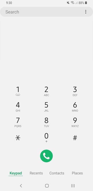
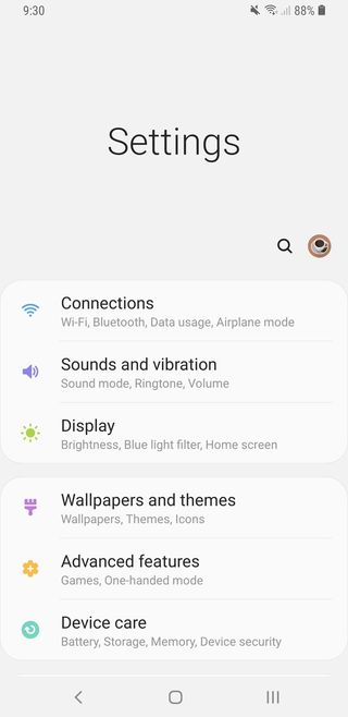
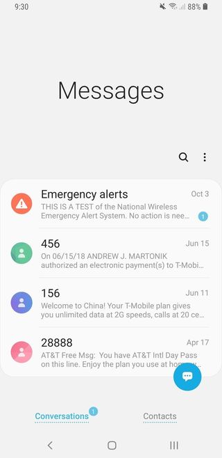
In most, but not all, of the interface Samsung is shifting touch targets further down the screen whenever possible. It basically makes the top third of the screen for viewing content while the bottom two thirds is for selection and input. Again, this may feel like a bit of a misuse of screen real estate to some ... but it's far easier on our thumbs and wrists.
It feels like a waste of space at time, but you can actually reach everything without contorting your hand.
Throughout most of the interface and default apps, whenever there's a scrolling list and content at the top of the screen, you can pull down on the list as if you wanted to scroll up further and the content will slide down to meet the range of your thumb. This leaves a pretty jarring amount of blank space with a single word like "Settings" or "Messages" at the top, but it lets you reach the content without contorting your hand. And when you scroll up, things move to fill the space. "One-handed mode" is still available to shrink the screen, but chances are with One UI you'll find even fewer opportunities to use it.
This change to bottom-weighted navigation also matches up nicely with Google's overall design direction that's doing the same. Navigation bars in apps are almost entirely moving to the bottom of the screen to be easier to reach, so it just makes sense to do the same in the system itself.
You can enable a system-wide dark mode
Samsung now includes a system-level dark theme, which is a joyous occasion for many of us. It's under the heading of "Night mode" and is ostensibly designed to be easier on your eyes at night, as you can set it to only turn on from sunset to sunrise, but you can also force it to be on 100% of the time; and I suspect many will.
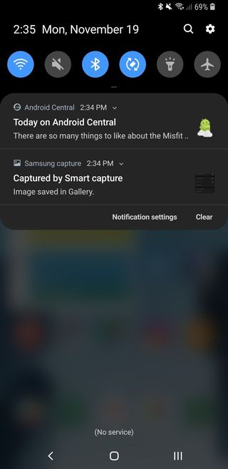
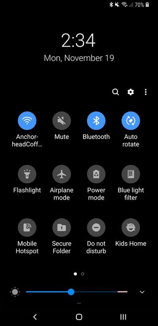
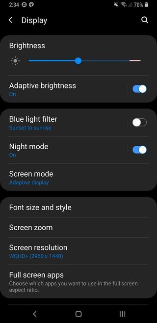
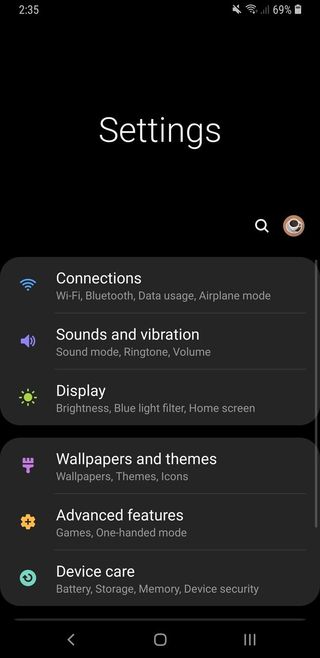
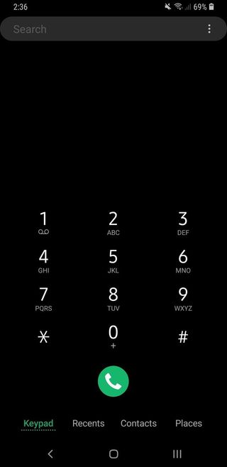
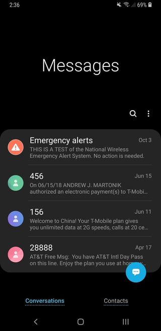
This is a very dark theme. It blacks out everything, and turns the accent colors to grey, white and blue. You still get some icons that come in various colors, but overall this will be much easier on your eyes than the stock theme. This night mode also goes deeper than any theme you can download from a third party and apply, because it covers 100% of the system and every system app. But unlike the dark mode on OnePlus phones, you can't change the accent color — you're stuck with blue.
There are new gesture navigation options
Samsung is using the Pie release to enable new navigation gestures, but it isn't really doing anything special here. By default, you get the standard set of back/home/recents keys, and they all work the same as before. The buttons have a new look, and the recent apps view has gone to a Pie-style horizontal scrolling list — but you can still long-press the recents key to launch multi-window. You also get the quick swipe gesture, pulling right on the home button, to quickly switch between apps or scroll through the multitasking interface — all without giving up the "standard" button arrangement.
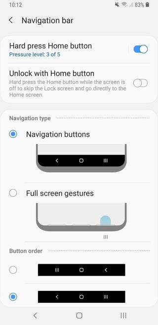
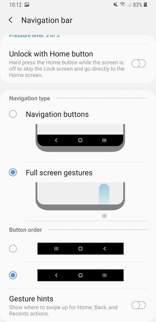
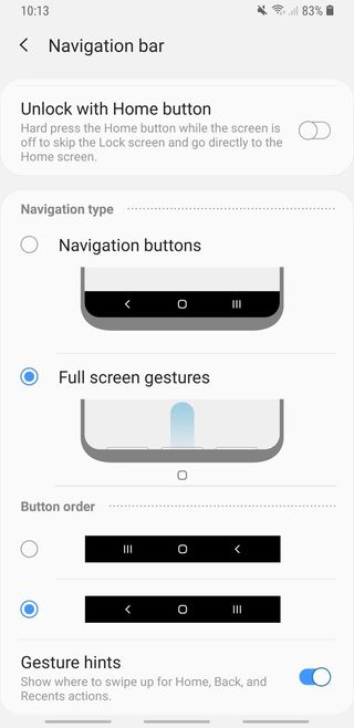
If you want to claim back that navigation bar space as you can on so many other phones, you can turn on gesture-based navigation, though Samsung's is more rudimentary than any of the others out there today. This is simply an option to be able to swipe up on the left, center or right side of the bottom bezel to use back, home or recents. There's no single flowing gesture to quickly switch apps or enter multitasking from the home button, which makes this far more clumsy to use than the three buttons. You do have the option to turn off the gesture "area" entirely, though, giving you 100% of your screen to display useful content.
The camera received some tweaks, too

Samsung isn't touting any improved camera performance, but the interface at least got a little tweak. There are new buttons up at the top/side for Bixby Vision and AR Emoji, and slightly tweaked text and iconography for all of the different modes. You can still swipe on the viewfinder to switch modes, or tap on them on the bottom/side to switch one at a time. Flaw detection and Scene optimizer are still here, unchanged.
I was sad to see that Samsung ditched one of its best camera app features: the ability to slide the shutter button to zoom. But now you have a small toggle button just next to the shutter button to quickly switch between 1X and 2X, where you can also hold and swipe to zoom between 1X and 10X. It's still smooth and far better than Google's camera interface, but I really loved the shutter button zoom — perhaps Samsung found it was too hidden for most people and wanted to surface the function with a more prominent interface element.
This is still very much 'Samsung' software
For all of the changes, you'll never forget that you're using Samsung software. Just like the Nougat and Oreo updates before it, this latest software release could easily be running on Oreo rather than Pie and nobody would notice. Samsung doesn't have access to Google's "Digital Wellbeing" software or app, doesn't use Google's default apps so doesn't benefit from their latest features, and doesn't yet use app shortcuts in the launcher. Much of the Pie improvements under the hood for battery optimization and the like are welcomed additions, but they aren't anything you'd actually be able to see.
How to get Android 9 Pie and One UI on your Samsung Galaxy S9
Samsung's redesigned most of its apps for the One UI release, but they still look like Samsung apps. And that's just what we all expected — this is the new Samsung identity, not a shift to the Android 9 Pie interface. Samsung has a massive base of customers who are very familiar with its software legacy; One UI just improves on it.
Andrew was an Executive Editor, U.S. at Android Central between 2012 and 2020.

